Graphic Designing Transmission For Them
At risk of showing a bit too much of how the sausage is made, I thought it might be interesting/of use to write down how I approached the art side of Transmission For Them. Let me know if you want to know anything not mentioned in here!
I’ve been on a huge sci-fi hype recently (mostly thanks to Mothership and everything about it), and I’ve always had a soft spot for the cliched VHS aesthetic. Those were my foundations for thinking about Transmission’s whole vibe. I also took a fair bit of inspiration from Death in Space.
When Zine Month approached, I knew that it was the motivation and deadline I needed to put something out. I started with the cover: 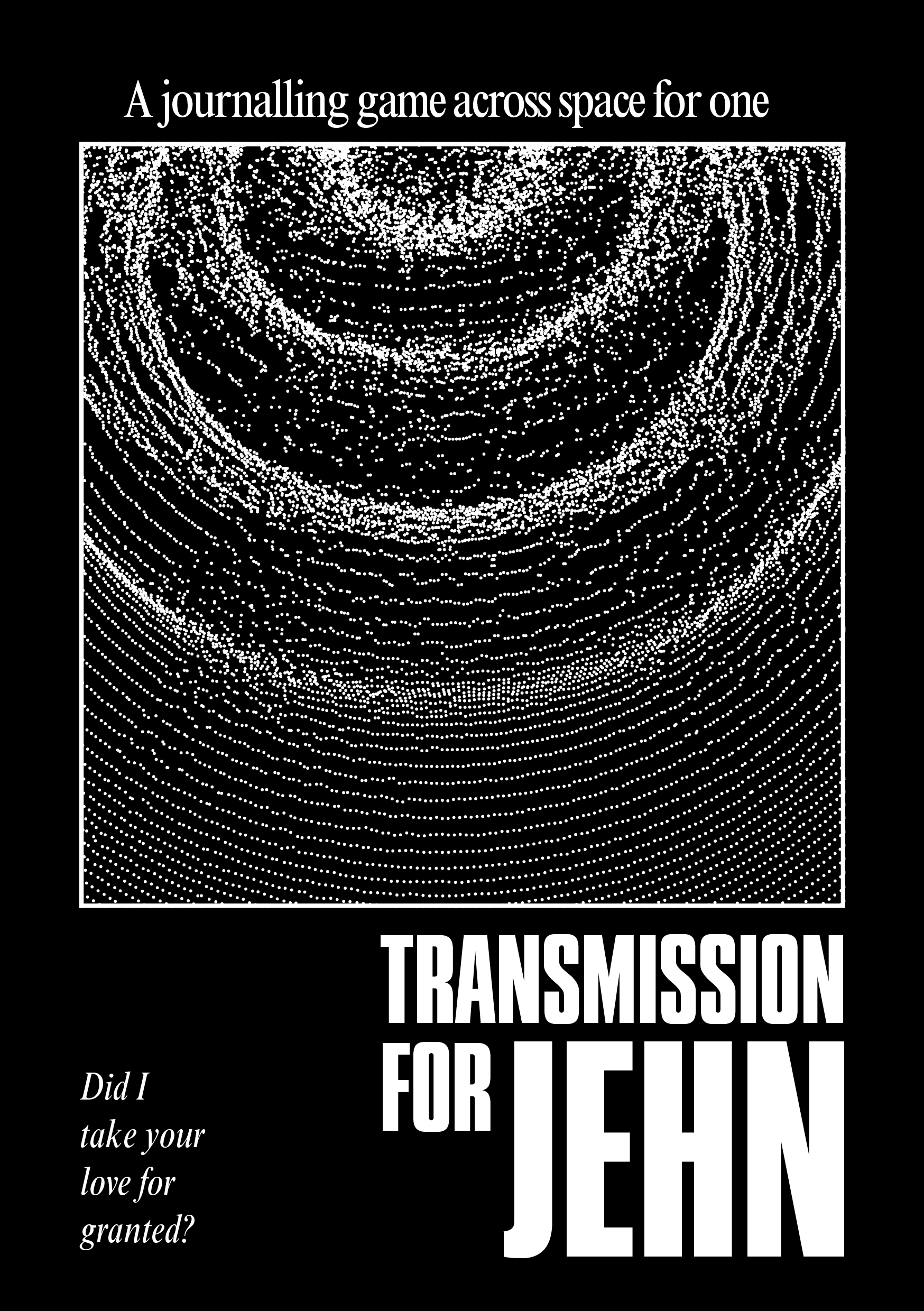
trying to write a solo journalling game and the writing bit isn't going so well so I'm making the awful error of starting layout first. also committing the cardinal sin of making everything white on black. print shop is gonna hate me pic.twitter.com/gqgx1e6ngs
— Eryk (@peregrine_coast) January 12, 2022
I shared the cover before I had anything else down - it’s pretty much the only thing that remained unchanged from start to finish. It got some cracking responses which really helped get over that initial motivation bump.
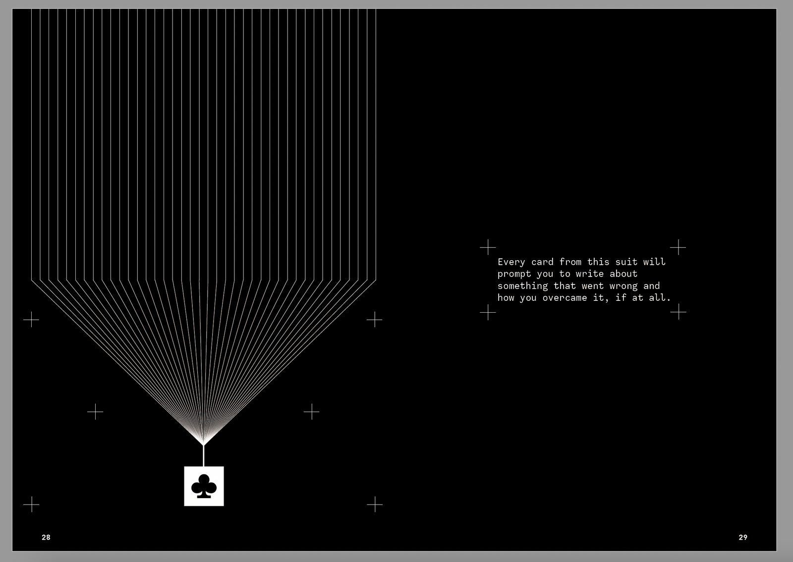
Choosing white-on-black was a huge constraint I wanted to test myself with. I’ve been learning layout and graphic design mostly through doing (and I want to give a huge thanks to everyone who paid for anything I’ve put out so far - you’ve basically been paying for me to learn in public), and Filmmakers Without Cameras and Demesne of Conflagration were both really maximalist, varied pieces of work. This was supposed to be the opposite: two colours, 16 pages, and a chance for me to try more graphic design.
The white-on-black feels like an obvious choice for a piece set in space: the dimensions of the page seem to fade away and the white text stands in stark contrast to its surroundings. It’s pretty neat!
 _first-spread.png
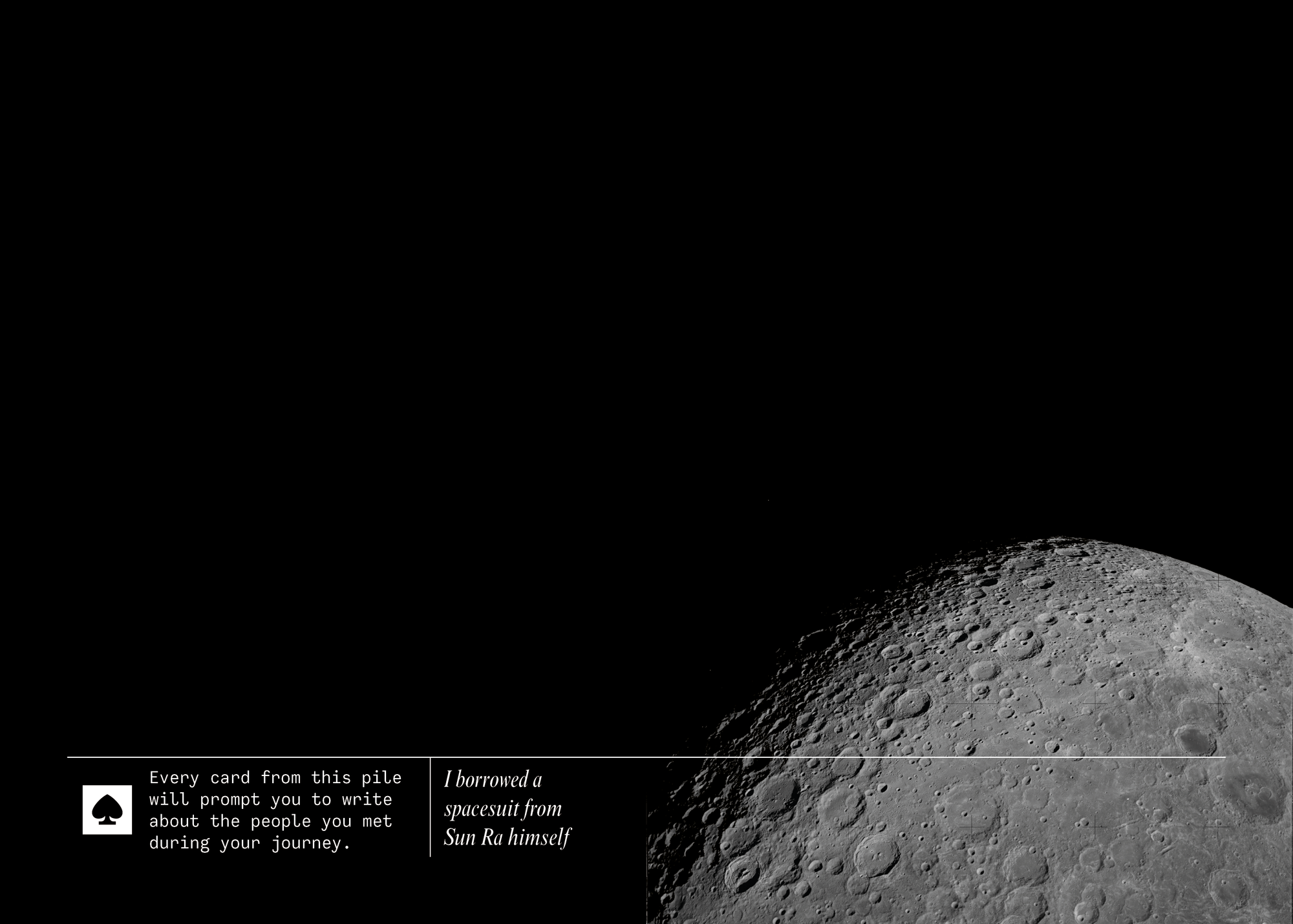
I got this idea of “elegance” into my head fairly early on - I wanted sharp lines, stark contrasts, and balance. Looking at these spreads felt amazing; I wanted to put one prompt on each page to give the prompts all that breathing room, to make them look lost in space. Alas, this thing had to get printed and bound somehow.
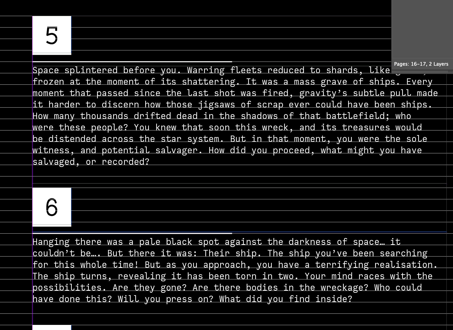
This was also where Sam and Josh, the writers, came in. My prompts up until this point were very simplistic: “How did you meet them?” and “What was your last argument about?”. They came in and blew my word limit wide open. There’s a running theme in my collaboration with Sam & Josh and Charlie. I went for ultra-minimalism, and they… didn’t. 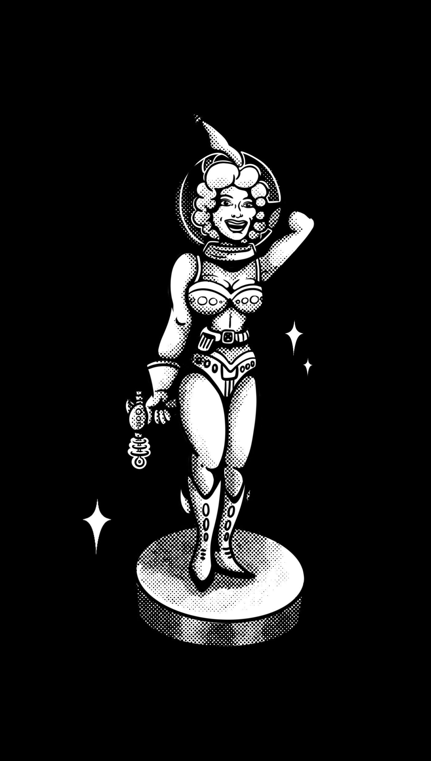
It made for a nice balance. Transmission For Jehn is a magical piece of work; the narrator talks about going to space as if it’s no big deal. He has Sun Ra on speed dial, and he makes short work of Europa, Io, Ganymede and Callisto. Contrasting my layout inspired by the sharp lines and contrasts of hard sci-fi with Sam & Josh’s descriptive, flowing prose and Charlie’s psychedelic lines ended up in a great marriage of the real and fantastical. At least I think so - I hope it comes through!
Charlie’s art piece above is lovely, but it doesn’t actually appear as a spot anywhere in Transmission (though it is in there - bonus points to anyone who can find it!). We agreed that it was a bit too booby for the vibe we wanted and had to go back to the drawing board to find a style that was more reflective of Transmission thematically.
There’s also a reference in Transmission to a film I have a lot of love for - I was worried it was a bit too on-the-nose but so far nobody’s pointed it out. The first person to point it out will get a free, limited edition Transmission For Them patch 👀 
Combining the real-world Moon landing photography with Charlie’s art is reflected in our prompts, too. At any moment you could draw a card asking you to reflect on very human moments with your partner, while another card could ask you to reflect on the pod of space whales swimming alongside your spaceship. Magical realism is another soft spot of mine.
I still threw in some ultra-minimalist bits, though! I approached most of the chapter headers by asking myself how I could represent the key ideas of each chapter as minimally as I could. No ideas come from a vacuum, though, and I spent an unholy amount of time scrolling down Pinterest. My main feed is still mostly made up of white-on-black art. 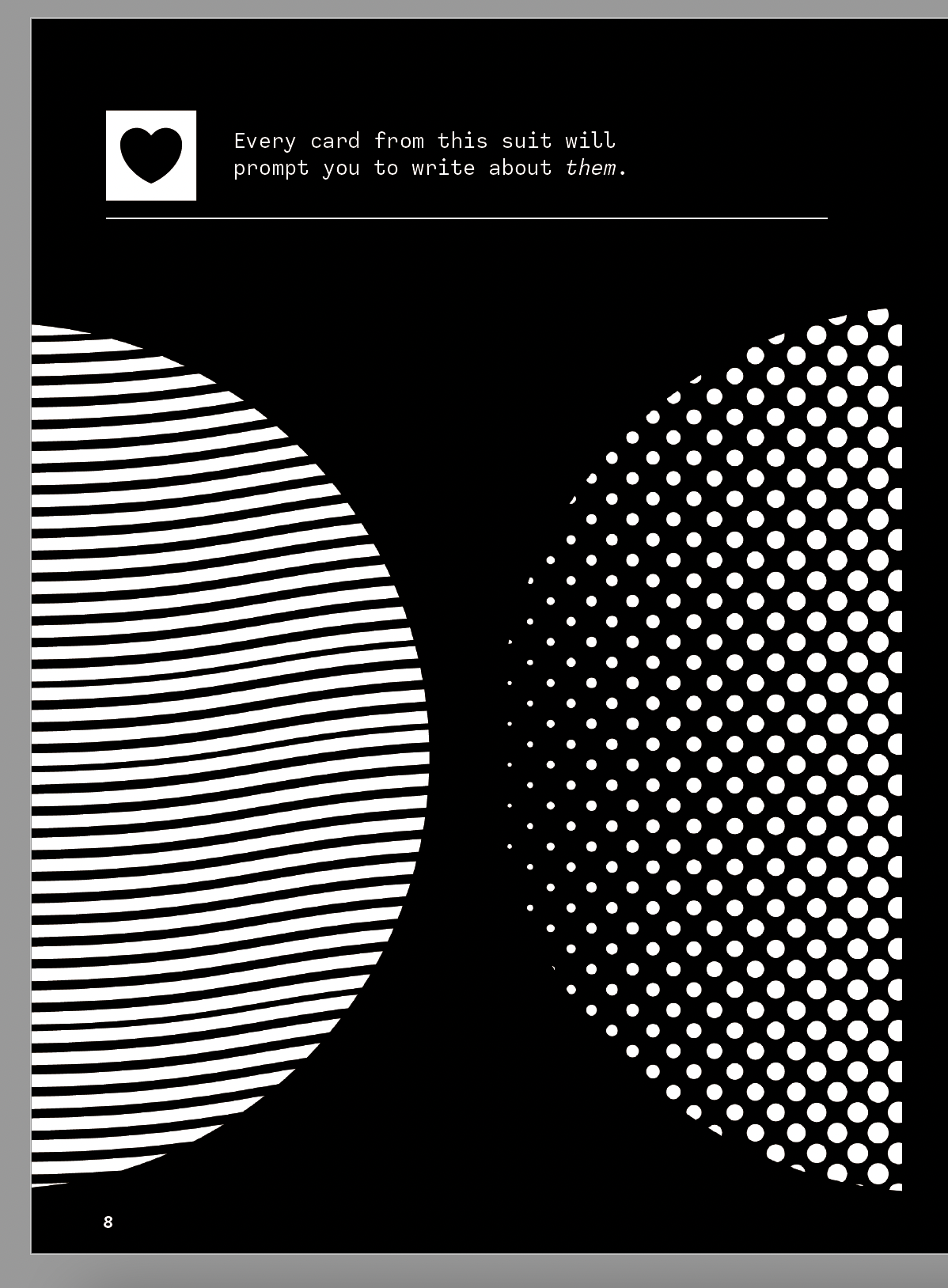
 —
—
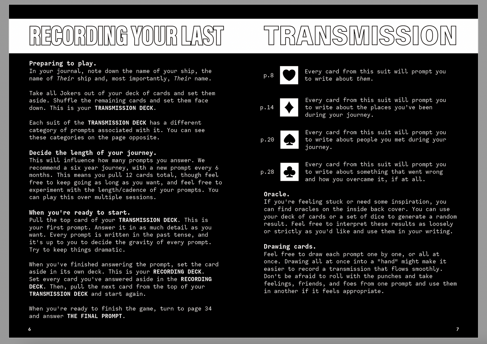
Here’s the nitty gritty: by far the hardest and most tedious bit of the whole process was fitting prompts into a layout which conveyed space but also remained economical to print. I set down some ground rules to start with:
- Each prompt could not break on to another page.
- Each prompt had to be easily referenced.
- Each page had to be balanced.
 By setting the baseline grid to match my desired leading, I could maintain an even leading between pages. I used that to figure out my total line budget per page: 50. From there, I knew that each prompt would take up at least 8 lines - 2 lines above and under to act as padding, and the remaining 4 lines for the card number and divider. This was hugely helpful in balancing each page - there were times where I’d be shifting two or three prompts around to free up one or two lines on a page.
I ended up changing header fonts fairly late into design - the opening spread gave me some trouble. When I initially wrote it, I really leaned heavily into the Transmission For Jehn inspiration. We steered away from that, luckily, and that proved to be a much more interesting direction. Below is the same spread as it looked at the start and end of the design process. 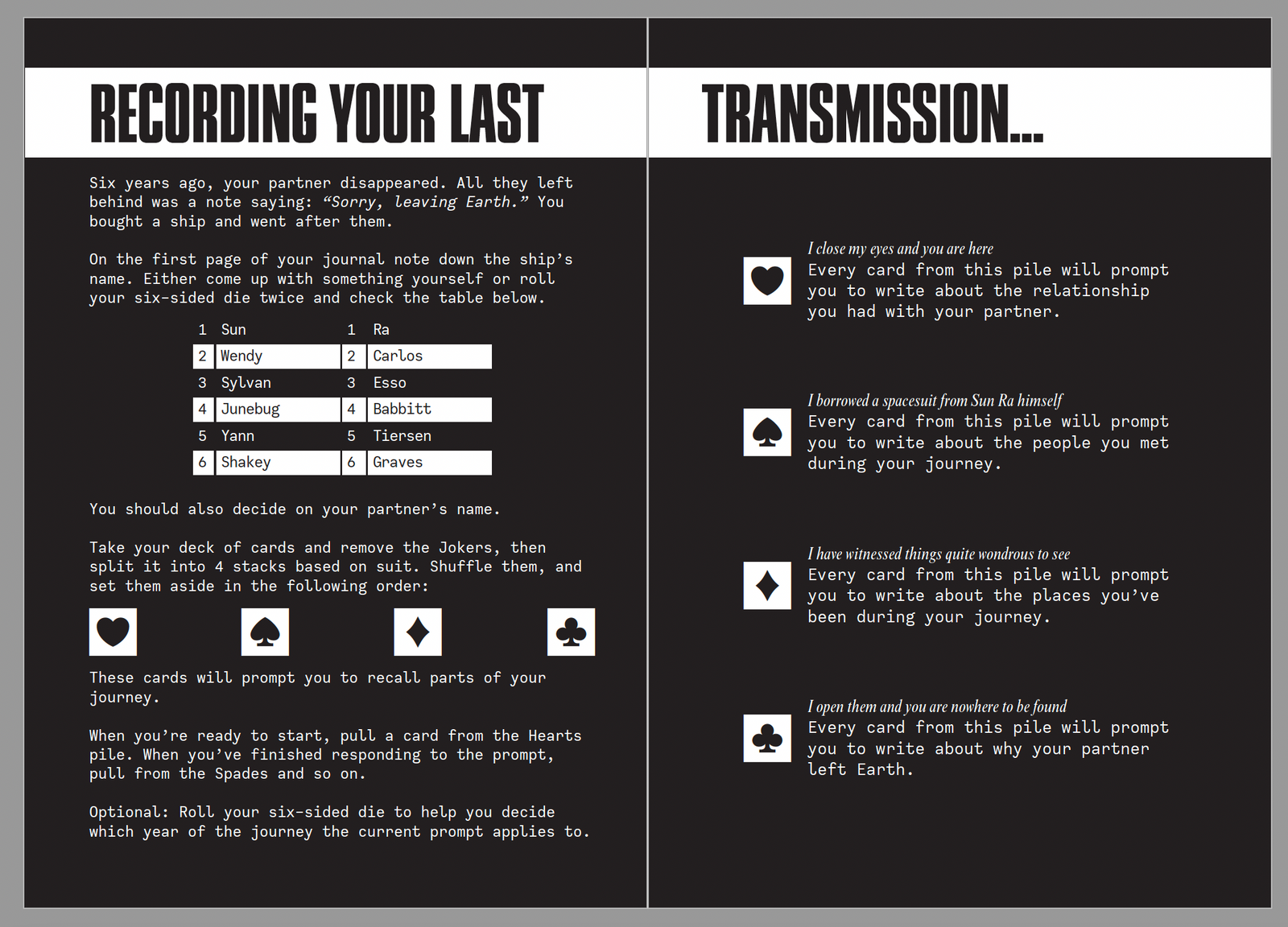
Ignore the colour difference between the two - that was an export mistake I made at the time.
The first header font was the font I’d used on the cover. I tried to make it work for the sake of consistency, but it’s fair to say that it didn’t work at all. The new font was a bit of a cheat; it’s variable so I could tweak its width to fit the space.
I hope these half-formed thoughts made sense and are of some use ✌
You can buy a physical copy of Transmission here.